Marshall redesigns Strand hotel
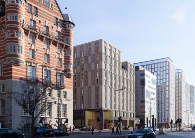
After acquiring the site and submitting a planning application earlier this year, Marshall CDP has put forward redesigned proposals for the 10-storey hotel in Liverpool city centre.
The rejigged design, which follows an initial planning submission in April this year, features significant changes to the external cladding as well as the addition of one bedroom, bringing the total number of rooms up to 168.
The proposed site has been vacant since the demolition of Kingston House in 2010, and while planning permission was previously granted for a 99-home, 14-storey residential development, this was never progressed. The plot is opposite Mann Island and falls within the UNESCO World Heritage Site buffer zone.
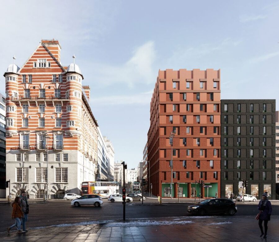
Studio Mutt is acting as architect and has designed a primarily brick-clad building which will be accessed via a colonnaded entrance on Strand Street, where there will also be a ground-floor restaurant. The hotel is split-level hitting 10 storeys at its highest point.

The original design submitted in April this year
The developer argued the proposals would “capture the potential of this critical site which is located along the world famous Liverpool skyline”, and would “generate a new high-quality hotel offer within the city attracting increased visitor numbers and dwell time”.
Marshall CDP has delivered a number of other hotel developments in the North West, including Hotel Gotham on King Street in Manchester. It is also currently on site delivering a hotel and casino for Brooklyn on Portland Street, also in Manchester, and has completed Travelodges in Northwich and Burtonwood, Warrington.
Elsewhere, it has delivered De Vere Hotels in Edinburgh and Glasgow; a Ramada Encore in Gateshead; a Premier Inn in Halifax; and a Travelodge in Darlington.
The professional team on the project also includes Curtins, Sandy Brown, Booth King, and Wardell Armstrong.


Disappointing, I was hoping for a better render and taller building.
By Liverpolitis
What was there previously was awful, as is this!
By Acelius
Needs to that height to fit with scale of neighbouring buildings….I like and want more tall buildings….opportunity in the growing cluster towards princess Dock and in developing business quarter BUT bland and not worthy of that important site
By Anonymous
‘Well, knock me down with a feather,’ said no-one ever about this design.
By Sceptical
What a terrible looking building for such a prominent site. The architects should be ashamed to put their name to it.
Back to the drawing board….
By Roy McDonald
better than the first design but so was the current Lime Street development that replaced the Futurist. Doesn’t mean its worthy of its location. Back to the drawing board and third time lucky I hope
By Anonymous
This looks like one of those situations where the architect has been instructed to develop an appalling “Straw Man” design for consultation, to cover for a lacklustre “Actual” design.
The industry needs some more integrity – architecture is competitive and we all have to pay the bills, but surely we all need to sleep at night too… being responsible for either design in a WHS would give me nightmares.
By A Nightmare on Strand Street
Am I the only person who likes this?…
By Question?
Not good enough for such a prominent site. How and why does that staircase keep escaping the chop too!
By L17
Somehow, they’ve managed to make this (waste of prime commercial space) even worse than their first go.
By Mike
I don’t like it! The original was much better as the colours and particularly the proportions complemented the White Star Building much better. Not worthy of this site!
By Liverpolitan
@Question? No you’re not. It’s a subtle scheme designed by a very talented practice and I’m certain this will be the most modern building on The Strand. Miles and shoulders better than all those next to it on that side!
By Optimist
That should read *head and shoulders!
By Optimist
Poor, poor, lazy half-arsed architecture, not impressed with these new kids in town, this faces the 3 Graces but seems to pay more of a homage to the dreary Travelodge and Tezza’s next door.
By Fab1
Looks alright to me )
By Anonymous
It’s MUTT ugly. Looks like a bunch of cardboard boxes left out in the rain.
By Doctor
Needs more active street frontage on the James Street elevation. Looks more than fine for a low budget hotel.
By Anon
This is a perfectly adequate design for the location.
People are probably comparing this design to Mann Island but forgetting that those buildings and their expensive cladding were paid for by central government. The specification of this building is a more realistic reflection of where the market is at in Liverpool at the moment and what is financially viable.
By Klopp’s shiney whiteys
This is atrocious, not fitting for this location at all. This is the strand, home of the three graces not some brownfield site where any old design is ok. Absolute disgrace.
By Peps bald head
@Klopp, when you look at what is being built further along the strang with the Lexington and Infinity (Not saying height should be of the same scale), but they certainly in my opinion are of more redeeming quality and visual interest than this and shows what can be delivered
By L17
‘Perfectly adequate’ is not a phrase that most would consider acceptable for a site of this importance. Studio Mutt don’t look like a practice that do ‘adequate’ – have their hands been tied by the planners?
By LEighteen
Height would have been welcomed but the architect was probably constrained by Regian House to the rear and the height of the streetscape.
By J
Seems that the local architecture community are quaking in their boots at the idea of some architects coming along and doing something other than cladding panels.
This is a much needed step in the right direction – communicative architecture over flashy and ill-conceived one liners.
By T
Its better than the first one but lets be honest its still not good enough for a site in this location.
By Oscar
I think the horse already bolted when the travelodge was built. As such this fits in okay with that. The time for a tall grand design full of offices was before it was allowed.
By Morgan
@Morgan – The horse didn’t bolt with the Travelodge! This is on the corner, you can do much more with corners, you can make a statement, a subtle statement that took into account the architecture of Norman Shaw on the opposite corner, and the very important cultural associations of the building. The proportions of the previous design were correct. This is a cost- saving exercise, yes, but should be refused as not good enough. The Travelodge doesn’t matter it’s one letter in the streetscape – This one is the capital letter at the beginning of the sentence! It matters!
By Liverpolitan
Something with a bit more imagination at least.
By causal observer
If you take a step back and look at the layout now Beetham Plaza, Strand Plaza, 30 James St, Strand Hotel, Travelodge, Strand House, 1 Park West, Liverpool 1, Hilton Hotel, Police HQ, the only building out of place and from another era is 30 James Street.. Just saying
By Step back
Let’s be realistic, the site is not that important, really. Far better it’s developed than sitting empty. This is perfectly fine for the location.
By Klopp’s Dazzlingly White Teeth
Awful bland and wholly unimaginative design for prime liverpool real estate. Say no to this planning dept, shockingly bad.
By Andy king
If you take your step back into Mann Island from where this whole assemblage is best appreciated you will see a vast square surrounded by monumental buildings with one missing corner. As the Strand is ‘greened’ Mann Island (the Square not the building) will be a crucial focal point. It’s amazing already from this vantage, surrounded by the Port of Liverpool Building, Rowse’s Mersey Tunnel building and the White Star Building, and the Mann Island buildings, but this corner is crucial to complete the picture. It must complement the White Star building! It’s in a World Heritage Site, and even if it weren’t the significance of the White Star building and the company that pioneered passenger transport across the oceans should be reason enough.
By Liverpolitan
Another truly ugly proposal. That said, what’s next door in James Street is far worse.
LL
By Liver lad
This just isn’t good enough for this location. The first attempt was truly awful in so many ways and this is just bland and rather badly proportioned in massing… this needs to be got hold of by the city region and their design champion Paul Monaghan (they sit opposite it) – has this had any kind of design review…!?
By OMG
Most of Liverpool city centre would look like this hotel if free markets existed in the 18th, 19th and early 20th centuries. Luckily for Liverpool and other places (but mainly Liverpool as it was so dependent on its port), we benefitted from the overseas exploits of the British Navy and the machinations of the British state to accrue abnormal profits which allowed us to spend large sums of money on fancy buildings.
So let’s be a bit less critical about this hotel. It’s actually a decent design and a more honest barometer of where the city is at commercially. In that sense, it is perfectly suited to its location.
By Klopp’s blindingly white dentures