


Morgan Capital lodges revised plans for New Victoria office
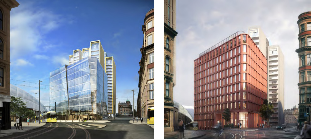
Designed by London-based architect Piercy&Company, the 160,000 sq ft Manchester proposal supersedes an earlier iteration of the building progressed by Muse Developments.
Muse won permission for an office and two residential buildings at New Victoria in 2016 and Vinci is on site delivering the 520-apartment element.
Morgan Capital bought the office plot from Muse for £60m last year on behalf of Toriview, a private family office, and set about redesigning the scheme to make it more sustainable and to cater for changing occupier demands.
The previous designs, drawn up by Sheppard Robson, were for an eight-storey building with glass facades.
Under the revised proposals, Morgan Capital is seeking consent for a 10-storey building off Corporation Street next to Manchester Victoria train station.
The developer is targeting a BREEAM ‘outstanding’ accreditation for the building.
The eighth, ninth and tenth floors of the building will feature external terraces.
Deloitte is the planning consultant and Chroma is the project manager.
The project team also features Hollis, Sweco, AJP, Gardiner & Theobald, SCP, RLB, Ball and Berry, Fulcro, RBMP, Rachel Hacking Ecology and KM Heritage.
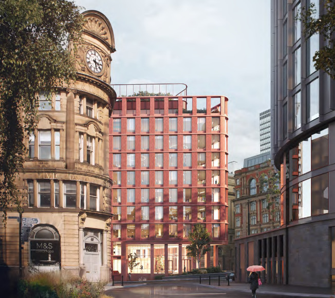
Piercy & Company is leading on design. Credit: via planning documents
This unimaginative red box does not sit well with the mostly stone/stone coloured surrounding buildings. The previous design had some individuality and didn’t jar with its neighbours
By Anonymous
This is a huge improvement imo. Nothing against glass but we have enough going up at the moment. This is more in keeping with the area. Hopefully happens soon as well, as then they can sort out the surrounding pavements, which are an absolute disgrace at the moment outside Hotel Indego.
By Bob
Much better.
By ALL
No, this is atrocious and so much worse than the original proposal. Too brown and too beige. Gut-wrenching to see original proposals which are fine get revised into schemes which are far worse, we’ve recently seen something similar at First Street Plot 9a. I really do hope they reconsider.
By Verticality
This looks better more in keeping with the architecture in the area
By Anonymous
Fantastic!
By jrb
I’m sure it would look even more attractive if the colour of the material used matched better the sandstone of the other buildings nearby?
By Anonymous
Really good – much better than the original proposal
By Anonymous
This will age better. Mind you next to Hotel Indigo it looks like Durham Cathedral.
By Elephant
Glad to see this revised – fed up of soulless glass architecture going up everywhere in the city. This feels much more Mancunian and good to see Piercy & Company starting to work in Manchester and replacing the usual suspects and their bland architecture.
@Verticality – not a big fan of the new First Street Plot 9a design but infinitely better than the monstrosity Jon Matthews proposed before the current iteration!
By New Mancunian
Awful, stick with the original design.
By Anonymous
While generally I’m fine with the all glass office look, there is a lot of it around Manchester . This works better in context as long as they maintain the quality of the cladding brick.
By Anonymous
A massive improvement on the previous design
By Frank
A much more stolidly composite design working well with the Edwardian baroque and Italianate features of Victoria station and nearby buildings of Hanover and corporation street. The colour retains the industrial red brick colour of many manchester buildings so this redesign is much more familiar and fitting.
By James
Looks brilliant and much better than the previous. Get it approved and built!
By New Wave
Looks like about three other proposals in the city centre. Boring. Much preferred the original design
By Steve
Looks good – well grounded and compliments the old co-op building opposite in scale and material/colour. A classic city feel.
By Anonymous
@Anonymous There is a building opposite (Hanover) which has a combination of sand stone predominantly red brick. This building is perfect with similar corners to its neighbours. The use of one single colour works in harmony with the single colour from Victoria station facade.
By Andrew
It’s short on eighty storeys
By Eric
So so so much better!
By Anonymous
The original design was far from brilliant but the latest proposal is dull and disappointing, I just hope the quality of the cladding is of a high standard otherwise it will quickly look shabby.
By Monty
Amazing how architectural styles and tastes change. The original proposal now looks messy and a little cheap in comparison to the latest version.
Having said that, if done well, like the Deansgate RBS building that style can stand the test of time.
By Anonymous
Better CGI now, that actually looks good, far better than the first one.
By Don