Design review: Mann Island
 Part of our series revisiting five buildings completed recently in the North West. Reviews carried out by members of the Places Matter! design review panel , sponsored by Places Matter! and Hill Dickinson.
Development: Mann Island, Liverpool
Developers: Neptune Developments and Countryside Properties
Architect: Broadway Malyan
Content: Three buildings: 176 apartments, 200 apartments and 140,000 sq ft offices
Completion: 2011
Contractor: BAM Construct
Image gallery below
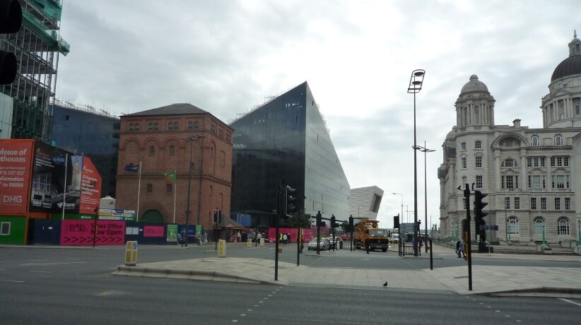
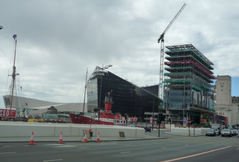
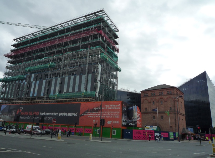
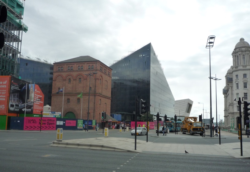
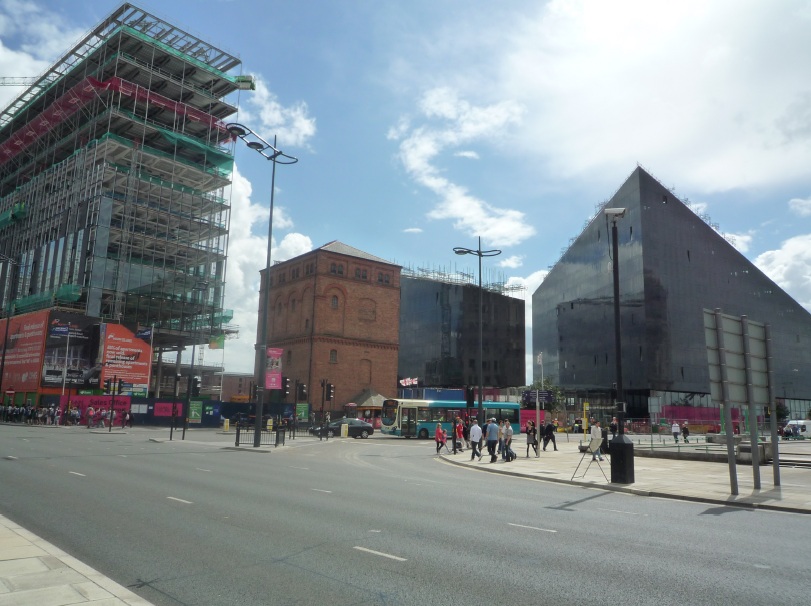
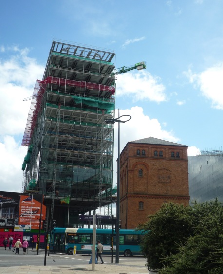
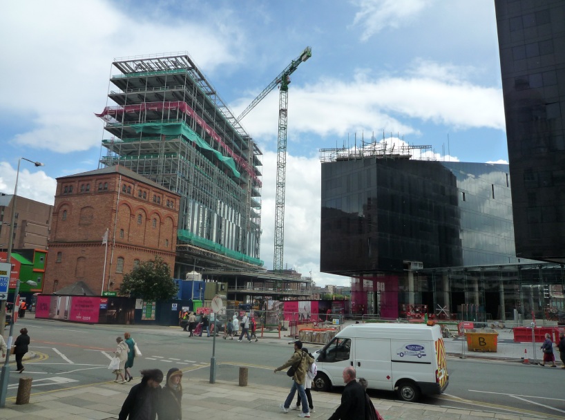
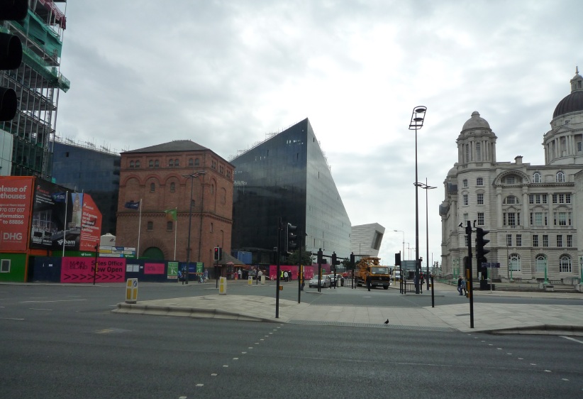
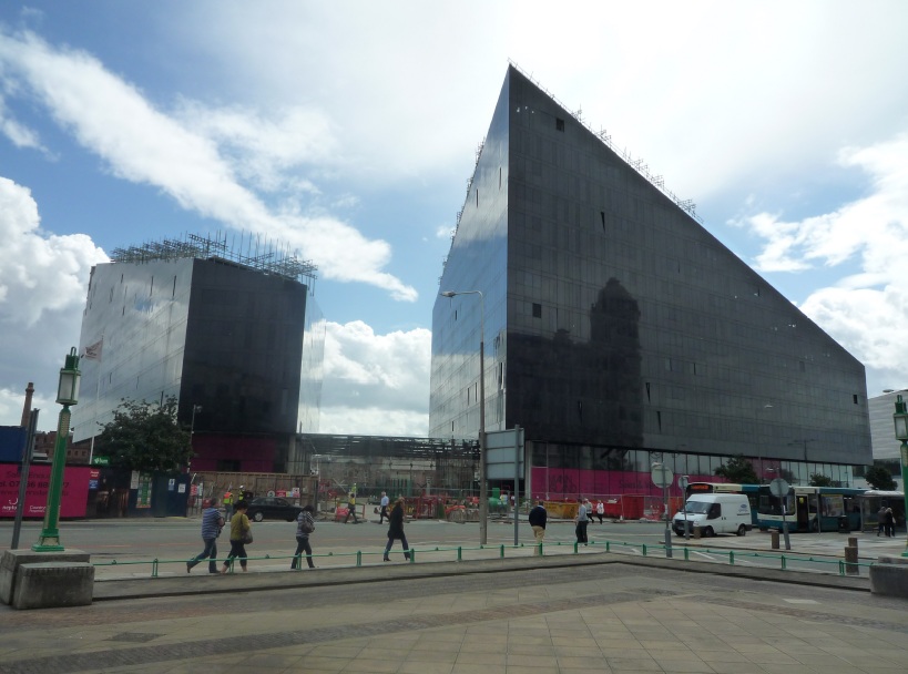
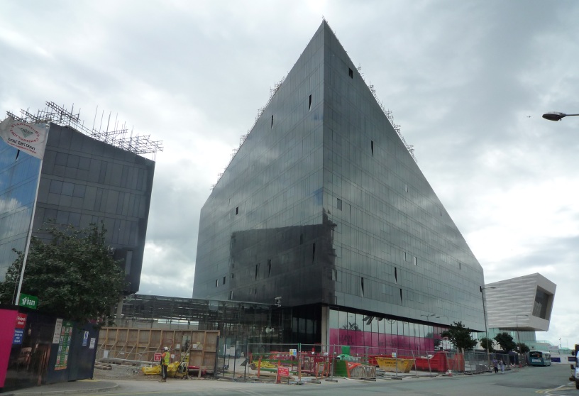
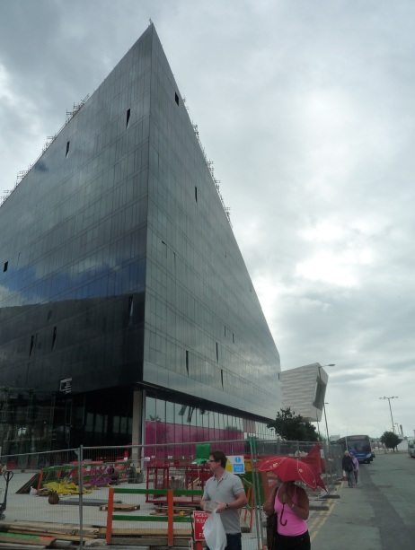
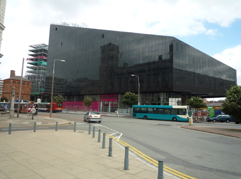
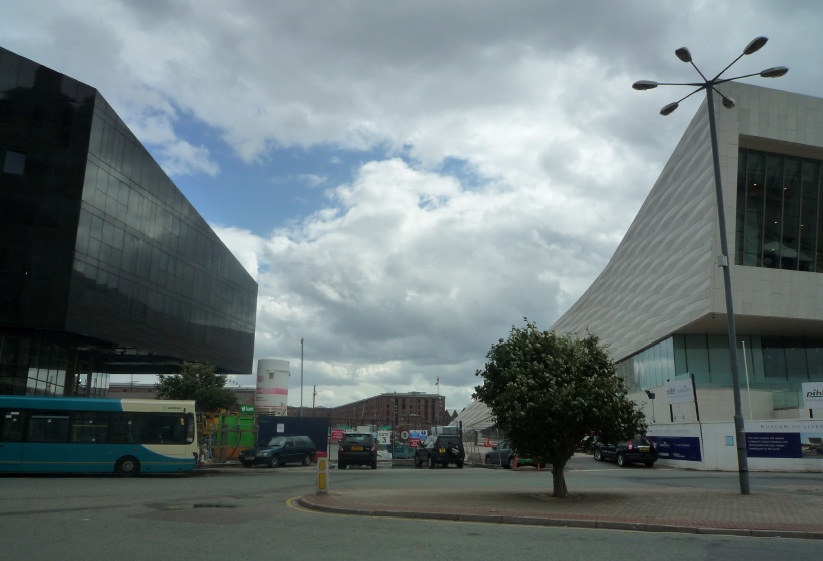
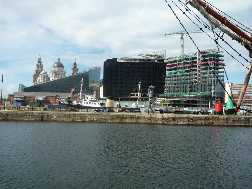
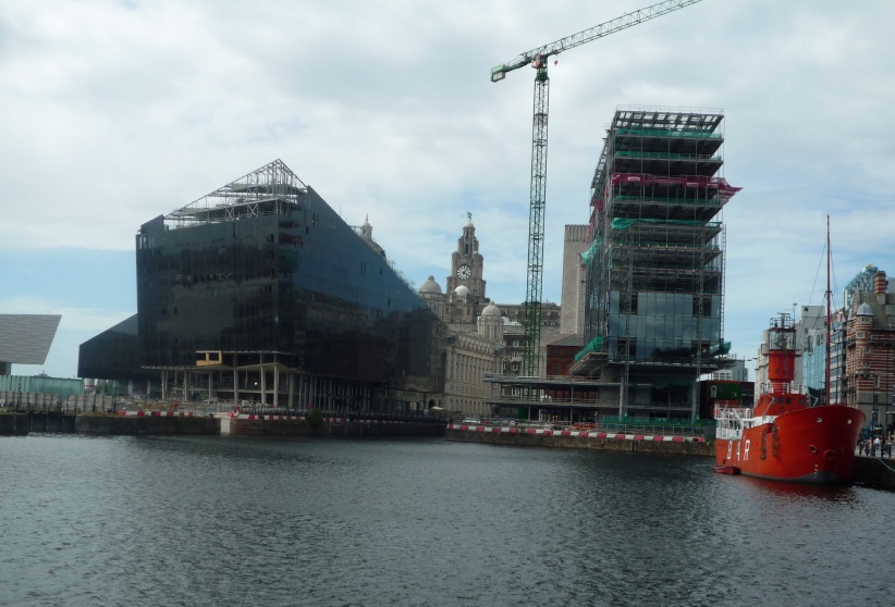
DESCRIPTION: Within the World Heritage Site and Albert Dock conservation area, adjacent to Strand Street and the Port of Liverpool Building. The main elements of the brief are two buildings of residential above retail and leisure and a third building containing office space. Two sculpted, inclined buildings form the residential element and the office content is in a more upright rectilinear building.
The plot was originally meant for the Fourth Grace that did not materialise and is a site of much controversy.
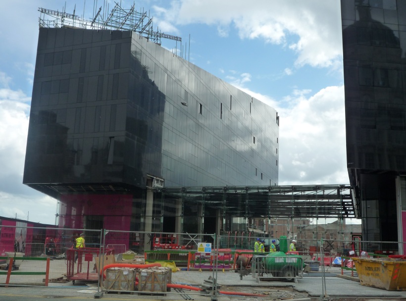
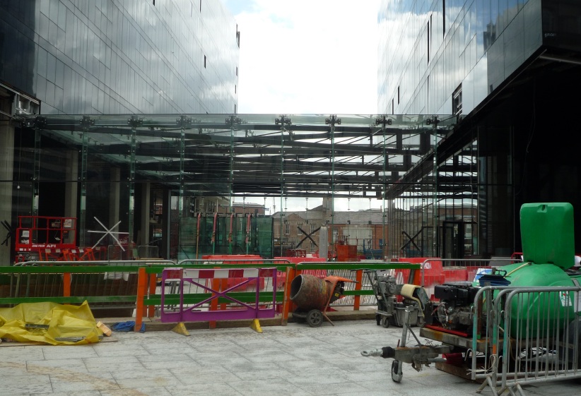
The two residential buildings are very close together and joined by a glazed covered winter garden, which acts as an entrance to the dockside and the new canal link.
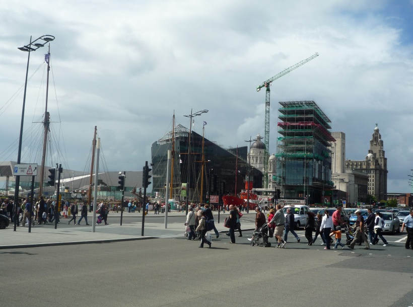
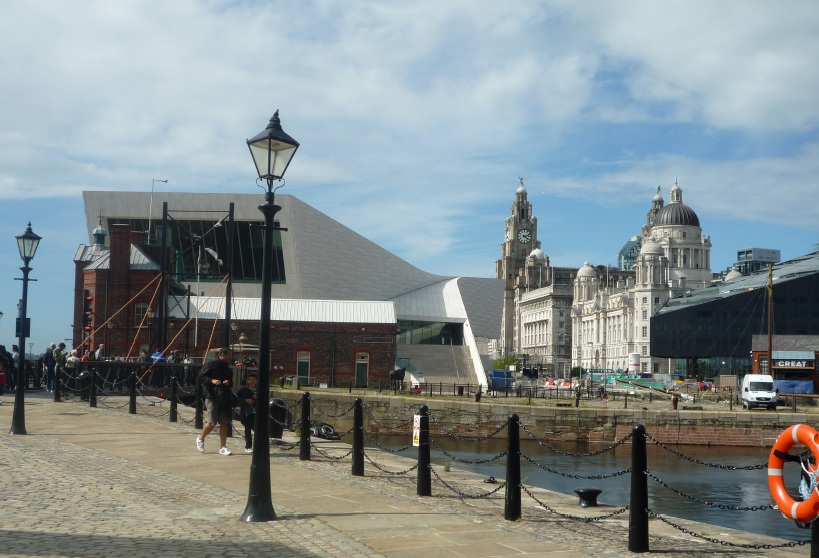
REVIEW: The arrangement and forms relate to preserving views of the Pier Head buildings from the Albert Dock. It's not just form-making for the sense of it; they actually are making some sense of their context and an incredibly powerful context. There is also a strong relationship to the new Museum of Liverpool building to the left. All in all, there's a volume of space there within which certain things could sit and the sculpted forms take acknowledgment of that context.
It's a tricky site to get that amount of accommodation onto and the architect has taken an intriguing approach to recognise and contrast with the surrounding buildings.
Walking around the development it is good to have these snatched glimpses of the 'three graces' of the Royal Liver Building, Cunard Building and Port of Liverpool Building that sit side-by-side next to Mann Island.
In terms of the two residential forms, their relationship is very close and serves as the main entrance, with residents peeling off left or right.
They are quite large scale and not competing with the three graces but of similar height. There needs to be sufficient scale next to such powerful buildings but they're not trying to compete in any way. They're merely stepping back in terms of their formal approach.
The views at night-time are going to be interesting. The two residential blocks will have a patchwork of lights on and the commercial one will be quieter. It is going to look very different to how we see it now during the day.
The view through the buildings is going to be interesting as well, funnelled by the lights of the new buildings.
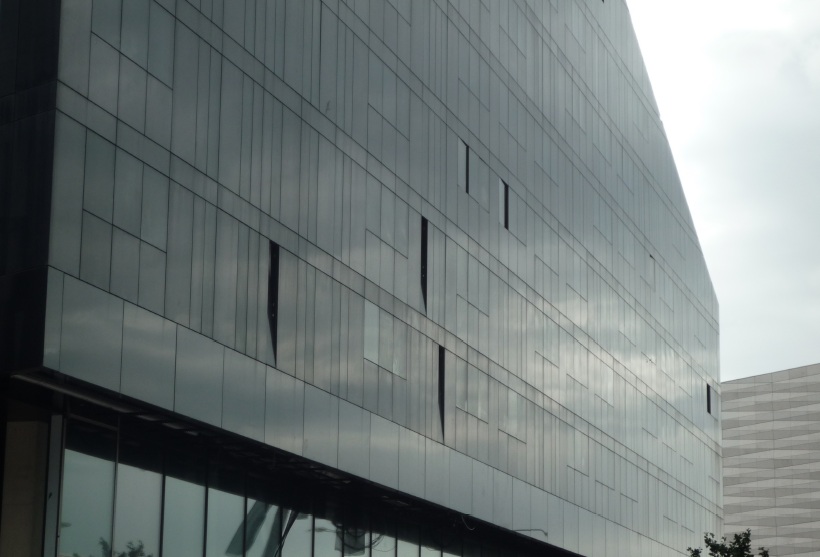
The black of the residential forms is quite light-absorbing during the day and the activity that emerges at night is going to be important to its success.
There is a strong overhang from the start of the upper residential floors above the retail and leisure. Research shows you need a good eight or nine metres height of overhang to work and they appear to have that.
The approach to detailing is very good, very crisply detailed, and the architects Broadway Malyan were clearly retained to work with contractor through to completion. This was probably a CABE requirement given the sensitivity of the site. The junctions of the elevations at the top and bottom are very well dealt with. All the windows open inwards and it will be interesting to see what views there are from the inside.
Within these residential forms there are actually light wells from which apartments are entered off a continuous balcony. This decked access normally leads onto bedrooms and as such that isn't going to be an oasis of quiet – it is going to be quite a noisy space whether that deck access is an appropriate model we are not sure. We would normally suggest trying to get an active room such as a kitchen or living room entering onto that deck space.
These are high value flats and their success will be down to the mix of residential.
One element of the mix is the balconies. The end units on each level have roof terraces, comprising an open area and an enclosed glazed area with a fully glazed roof and wall/doors opening out onto the external area). All units not on a south or west facing elevation will have an external terrace area within the enclosed central atrium space. These are open with a 1m or so high boundary wall. It's a tough place to be down there and we can imagine if you had a balcony there it wouldn't be long before you thought about enclosing it.
This is a spectacular site.
It is stunning that these new buildings are going up against that backdrop, it's very bold for Liverpool.
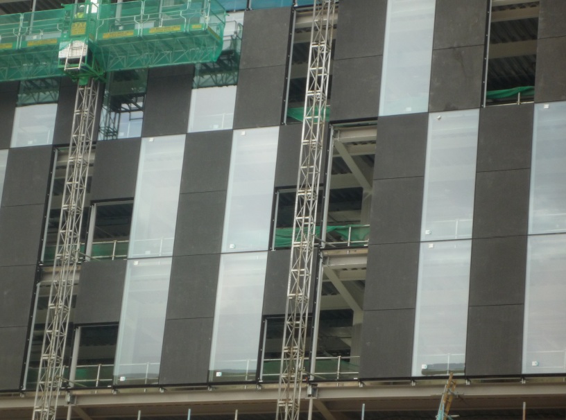
The commercial building in granite and glass is the least successful of the three. The space between the residential block and commercial block is going to be left open and one would hope the public realm would be treated appropriately to match the architectural ambition.
In summary this is an extremely challenging site but full of potential.
We would be looking for a developer to exploit all the potential and not be frightened to upset people but to be bold on a powerful site. It's generally successful in doing that. We're convinced by that use of very powerful bold forms, in terms of the inclined sculpted shapes. Contrasting the forms with the neighbouring buildings works well.
Arguably this very peculiar site means the buildings wouldn't work on anywhere else.



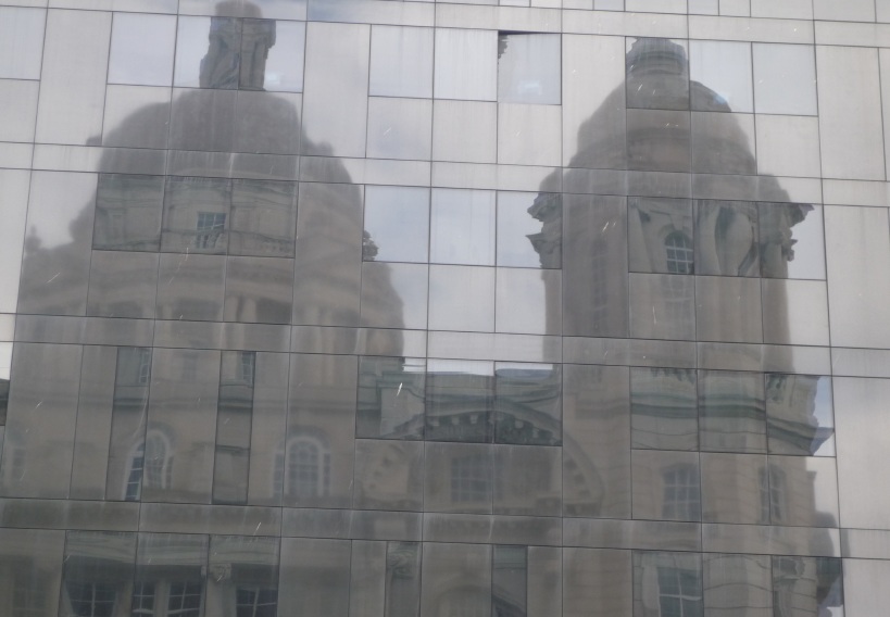
The reflection of the Cunard Building is a beautiful surprise – especially on a sunny day when the whole side of glass changes colour……just get your hat on for those winds off the Irish Sea. Fb!
By SHELAGH
Awful, just awful.
By Anon.
exceptional building, especially the internal aesthetics, very modern design. The internal rendered finish is second to none, a real eye pleaser.
By claire marie ellison
fabulous building views magnificent, interior walkways beautiful.
By debra