


How to format your blog posts to increase engagement and optimisation
All too often, I’ve seen promising blog posts fail to attract the readers they deserve, simply because of poor layout choices.
While yours might be packed full of interesting insights and actionable advice – it’s of little use if you’ve buried this under walls of text. And the sad fact of the matter is readers simply won’t bother to read a piece if it’s presented in a way that makes it hard to process.
In this guide, we’ll discuss some best practice in regards to formatting your blog content and offer some concrete guidance on the optimum way to set out your articles to keep readers engaged and make posts more search-friendly.
 Why do we blog?
If you’re reading this, I imagine you’re already sold on blogging, but when diving into the nitty gritty of creating content – it can be easy to lose sight of what you’re trying to achieve.
As far back as 2011, blogs were considered a critical element of online marketing and their importance has only grown since.
The frequency with which you post, the quality of what you post and what you post about are among the biggest considerations search engines (read ‘Google’) take into account when determining where your site should appear for any given query.
However, just putting words on a page won’t cut the mustard anymore and it’s clear that Google pays increasing attention to how engaging your content is by tracking things like:
- Whether users quickly or immediately return to the search results page after navigating to your blog post
- If your content could be considered ‘thin’ or low in value
- Algorithmic factors that enable Google to forecast user satisfaction based on surveys carried out by its Search Quality Raters (a massive focus group that manually rates websites).
So while blogging can definitely help you achieve search engine success, even if you somehow manage to weasel your way to the top of results with low-quality content, it’s not going to act as a very good first point of contact for prospective customers and if enough people find it’s not to their taste – chances are it’ll slide down search results as people vote with their clicks and Google takes user feedback into account.
How people read on the web
As I covered in detail in a previous blog, the assertion that people simply don’t read on the internet is false. Instead, they tend to skim-read – flitting to the points of the article that jump out at them.
Various studies back this point up, with 2013 research from Chartbeat suggesting that most visitors will scroll through roughly 50-60 per cent of an article. And a Nielsen study found that concise, scan-able and objective copywriting could greatly enhance consumption.
Heat map research has also shed a light into how internet users read, with reams of replicable results suggesting an F-shaped pattern is preferred by most people.
Actionable advice
So how can we put findings like these into practice?
Take care with Titles
People will judge your article by the title, not the other way round. Some suggest spending half the time you spent on the blog itself on the title and while I don’t think that’s always strictly necessary, you should definitely dedicate time to crafting an appealing headline.
You shouldn’t just expect one to materialise out of the blue, however, and it pays to do your homework:
- Research related queries via search engines and Ubersuggest
- Look for the top Google and Google News results on the topic you’re covering
- Take to Twitter and see what the most talked-about articles are in your field
- Use tools like Google Keyword Planner to discover how people phrase queries in relation to the topic you’re writing about.
Titles don’t have to be especially clever or pun-filled either and a descriptive – but fairly staid – headline can often prove just the trick for attracting readers and courting search engines.
Blank Space
Despite innumerable advances in screen size and resolution, it’s still harder to read things on a screen than in print. And no matter how good the blog – if people can’t read it easily, they probably won’t read it at all.
As such, it makes sense to break your text down into easily-digestible chunks. So don’t be afraid to make prolific use of paragraphs. As a rule of thumb, try to keep these to between two and five sentences.
Subheaders should be a similar staple of your blogs, so be sure to include plenty of these to sign-post skimmers to the sections they’re most interested in. And if you need to list something, don’t be afraid to fall back on bullet points.
Don’t choose funny fonts
Don’t exacerbate the difficulty of reading online by choosing a difficult font, even if it goes against the aesthetics of your website.
I’m personally a big fan of Verdana, but there’s innumerable ergonomic fonts to choose from. Ones from the sans-serif family are reputably the easiest to read, so if in doubt – try and stick to one of these.
Supersize Me
When it comes to font size, bigger is generally better. Although most browsers have zooming functionality these days, most people won’t utilise this.
In general, you want to be roundabout the 11 to 12 range, but avoid going too large or things might appear cluttered.
Bolding and Italics
Bolding key bits of text can help draw skim-readers’ attention to a particular point, but overuse will render this less effective. Try to be judicious with your bolding and confine it to things you really want to get across.
Retain italics solely for when you want to emphasise something in your text that might not otherwise be apparent. For instance:
“Google is the de facto search engine.”
Some people find italics difficult to read on-screen, while others just loathe them. So don’t risk putting off potential readers and keep these to a minimum.
Images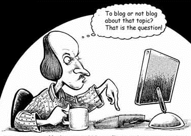
Blogs with images will perform better. How many you should include depends upon the size of your blog, but I’d recommend at least three for posts of a thousand words or slightly over.
As mentioned above, people read in F’s, so it’s a good idea to align your images to the right if at all possible.
Discussing what images work best and how to find quality, royalty-free ones is worthy of its own blog post, so luckily we’ve already covered this in depth in our guide to finding, sourcing and using images in blogs.
And if you’re referring to research or discussing data, don’t miss out on the opportunity to visualise statistics with graphs and charts, after all – a picture paints a thousand words.
Don’t forget to pay attention to captions and alt-text (a brief description about the contents of the image). The former can help to keep skim-readers in the loop, while both can be ‘read’ by Google – giving it a better idea of what your topic relates to and as such, what queries it might prove a suitable result for.
Quotes
Quotes are a great way to add credence to a point you’re making, but over-use can drown out your voice. In general, quotes should only make up a maximum of 1/3rd of your blog post.
It’s also a good idea to use call-out boxes (if you have the functionality) or embed them in images (if you have the time and/or necessary skills). Look at how key quotes are used and highlighted in print features to get an idea of best practice in this regard.
Sentence Length
Despite devoting considerable Google-time to this, I couldn’t find any evidence that sentence length has any discernible affect on content consumption. However, it’s a practice that many experts abide by, so it’s probably a factor worth paying attention to.
While it’s definitely not the biggest concern when blogging, pay attention to the size of your sentences and how readable they are. Above all, don’t become a budding Bronte, and keep comma usage, and sub-clauses, to a minimum.
Calls to action
Blogs are non-promotional by nature – letting you to tacitly show off your expertise in a field, without resorting to simply shouting about how good you are.
However, every post should close with suggestions on what the reader should do next, whether that’s buy, download, read more, get in touch, or anything else in-between.
Graphical calls to action can also work really well, highlighting the next step to skim-readers who might otherwise skip the conclusion of your content.
Incidentally…
If you’ve got any suggestions to add or think I’ve missed the mark, be sure to leave a comment below or get in touch via Twitter.
For those looking to generally improve their writing, I’ve also put together this handy guide, and if you’re after further tips on content marketing, don’t miss out on our introductory guide for property companies, which you can download for free right now:

Related Insights
Making the most of UKREiiF
You might be fresh off the heels of all the madness of MIPIM 2024, but we hope you haven’t packed your suitcases away yet because UKREiiF is knocking at the door. Like many of you, we’ll be in Leeds next month as one of the +10,000 event attendees for an industry conference that has quickly established itself as one of the must-attend events of the year.

Graceful degradation – is your marketing strategy resilient enough to succeed?
Like the products we buy, our marketing outputs should be built to last and adaptive to change. In this short blog we explore the concept of graceful degradation and how we can build it into our marketing.
Selected industry experts bring you insight and expert advice, across a range of sectors.
Subscribe for free to receive our fortnightly round-up of property tips and expertise
Selected industry experts bring you insight and expert advice, across a range of sectors.
Subscribe for free to receive our fortnightly round-up of property tips and expertise